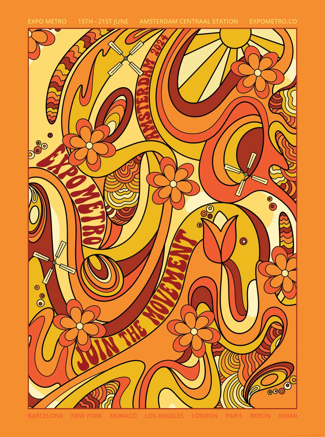
I have just completed Marte’s Domestika course, Creative Poster Design for Events and I thoroughly enjoyed it! Although I have created posters for my clients in the past, I’ve never had full creative freedom. The course gave me a chance to be more fun and free with colour, pattern, and subtle humour because I was designing for myself.
Three very important lessons I learned during this time was:
- I need more up-to-date software. 2007 Adobe Illustrator is restricting me from developing my skills even further.
- Creating your own typeface is an art form in itself. One that I would like to pursue.
- I absolutely love psychedelic poster art – who knew?!
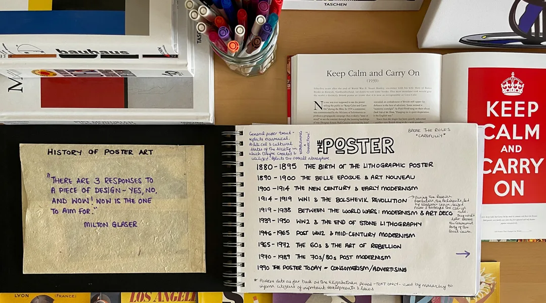
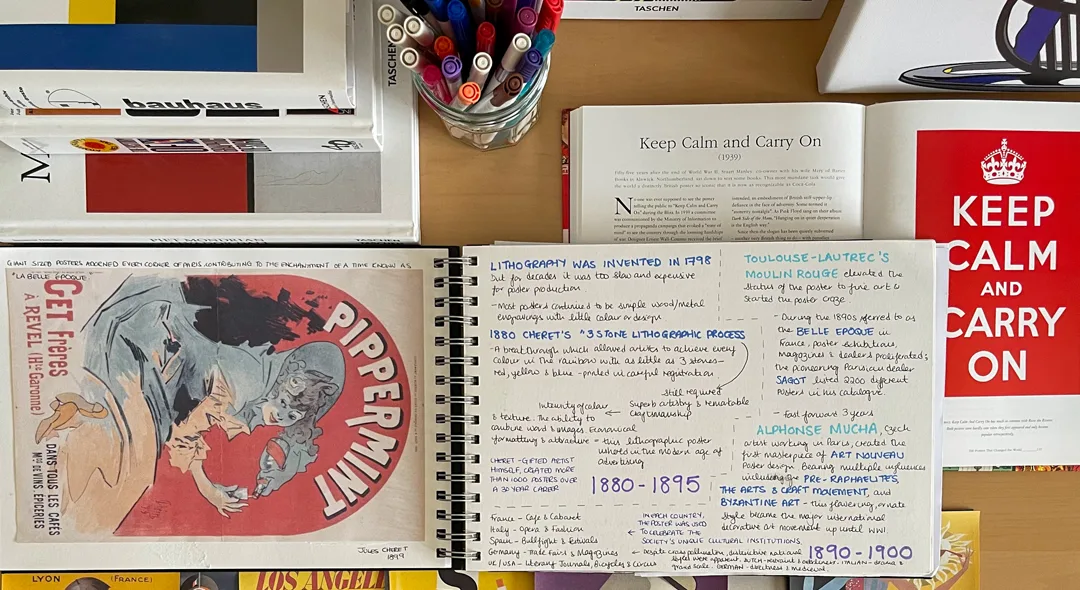
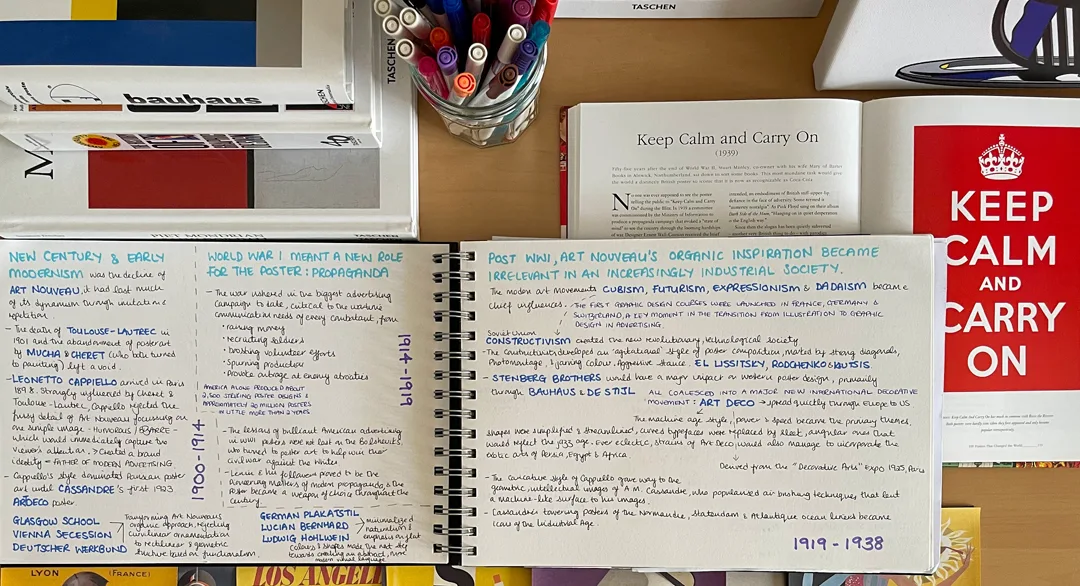
This musing is really to share a summary of my creative process. Let’s begin with the history of the poster – you know how much I love research to unlock those design ideas:
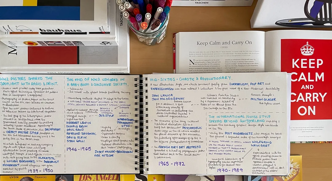
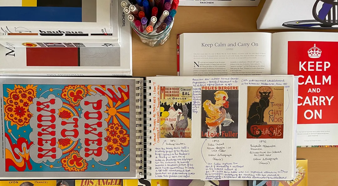
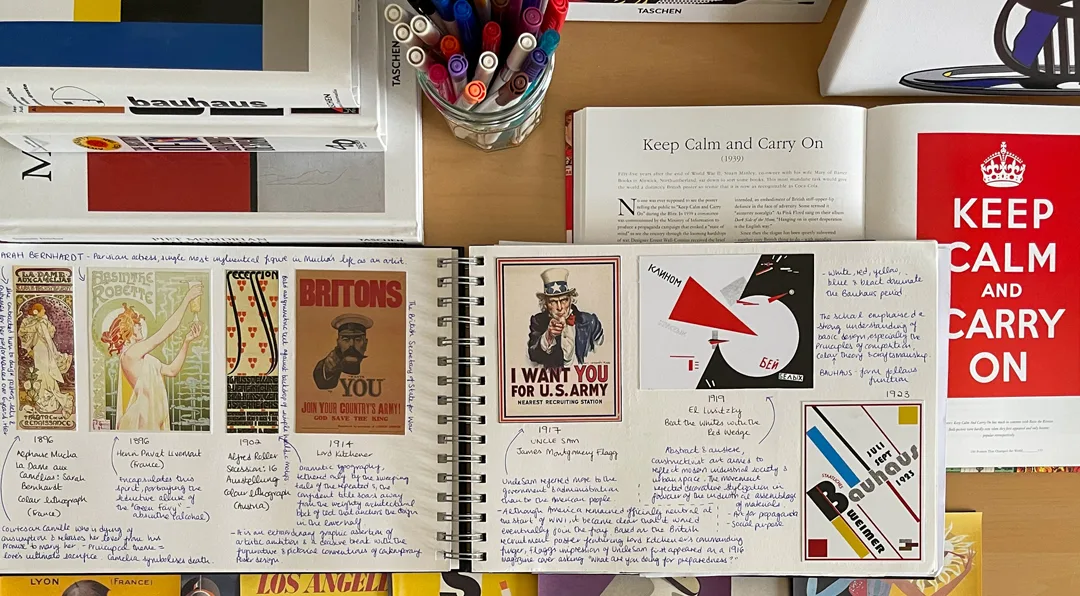
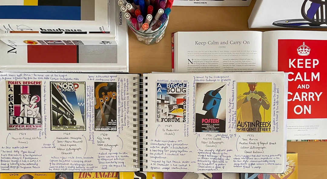
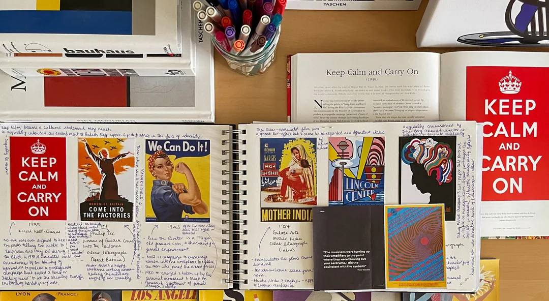
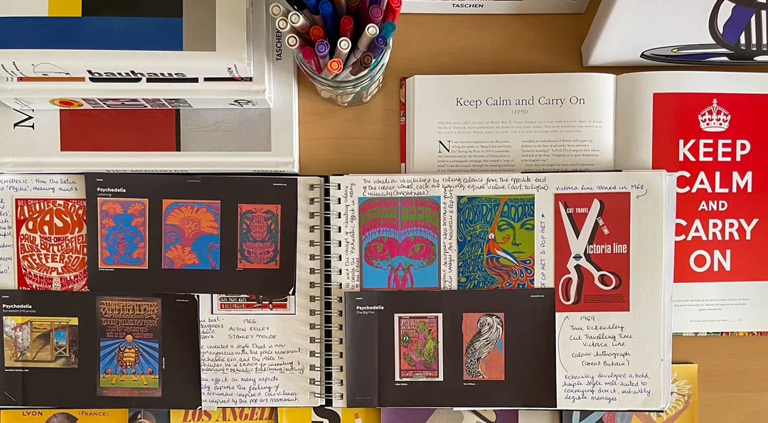
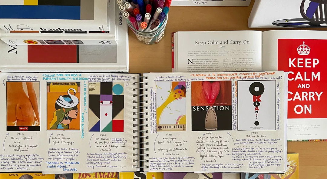
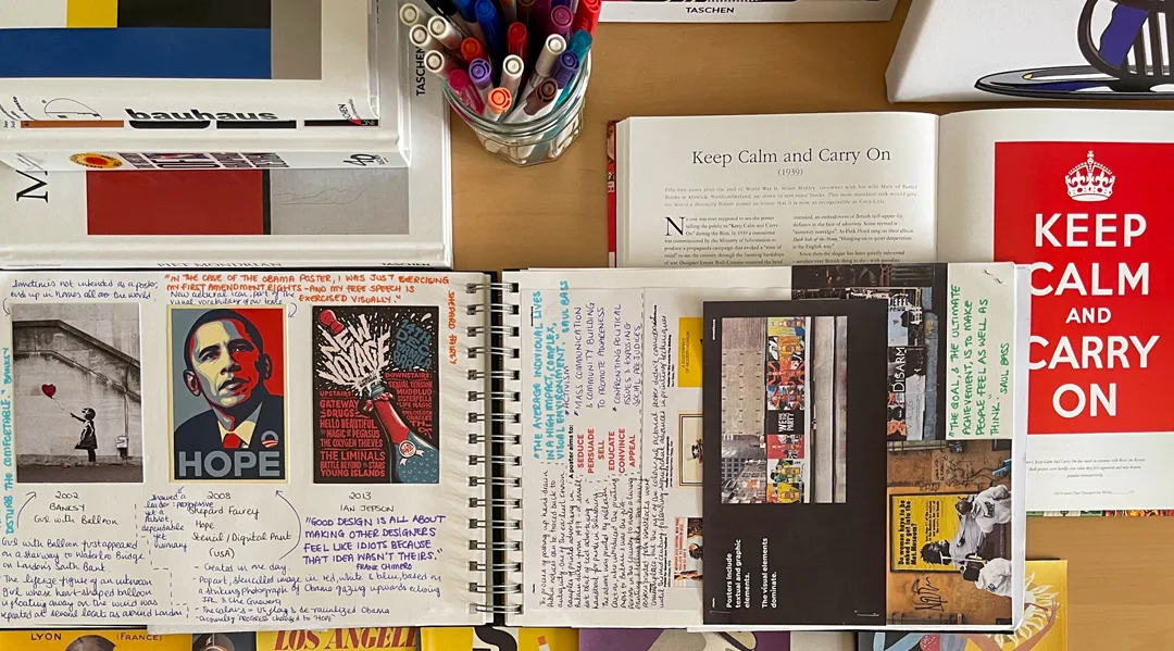
Mood Boards
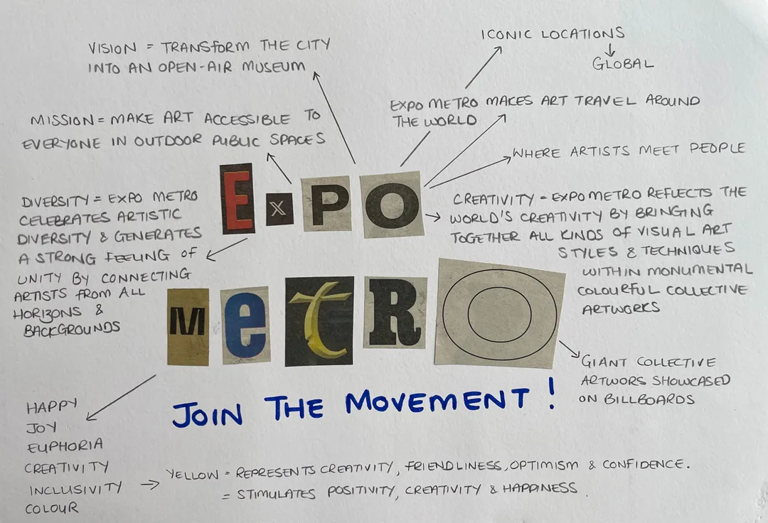
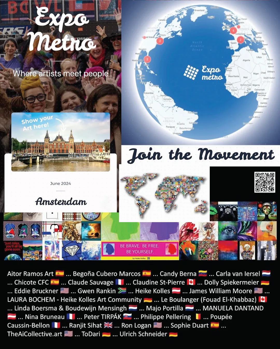
Expo Metro is a big part of my creative life at the moment,
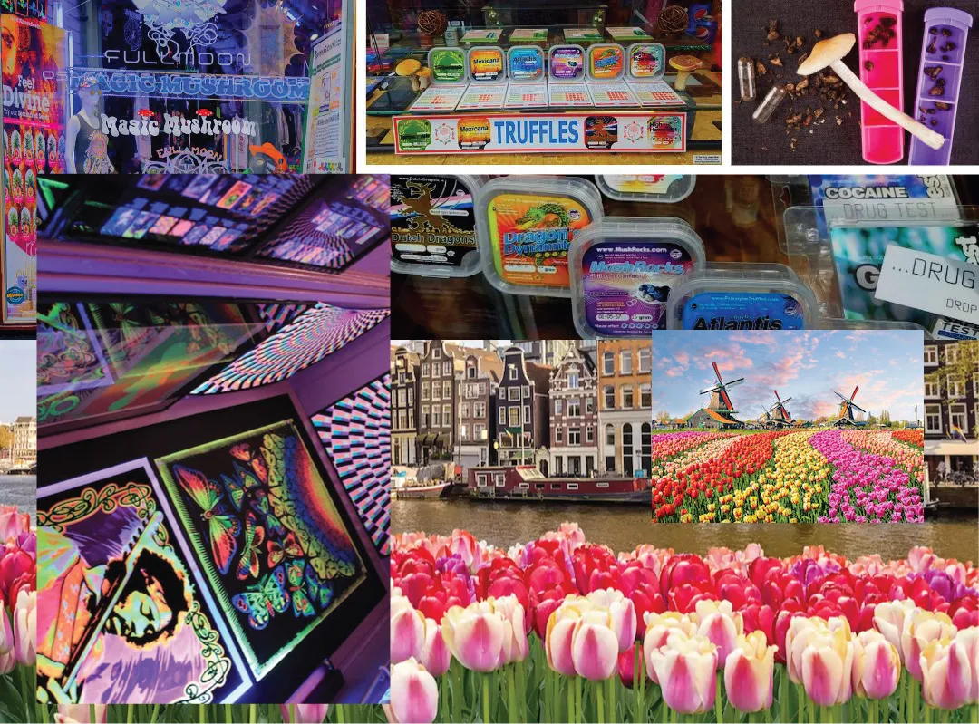
so I decided to create an event poster for the Amsterdam June expo in which I am taking part.
Brainstorming
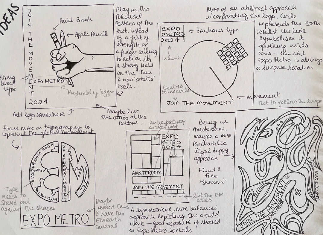
I’ll pick 3 to explore further.
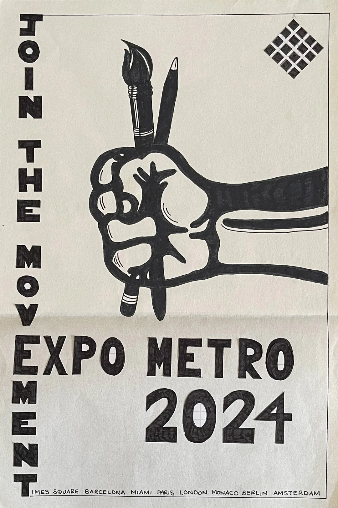
Design 1
A play on the political posters of the past.
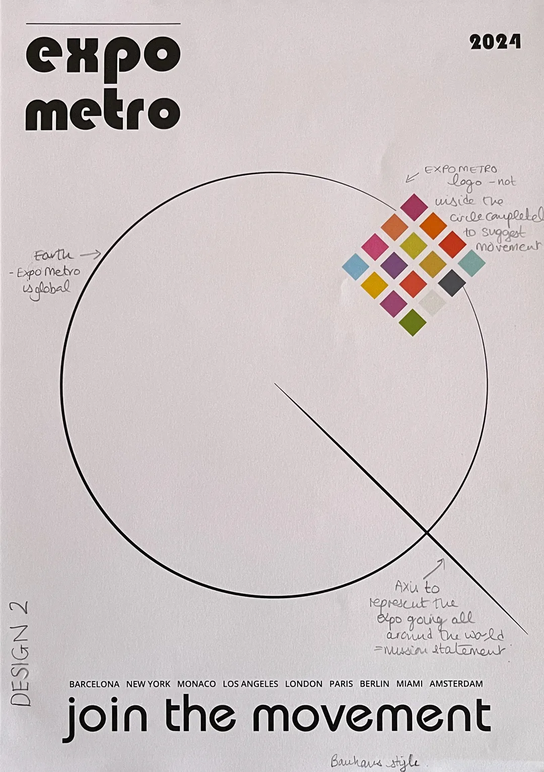
Design 2
A Bauhaus inspired style (love me some Bauhaus!).
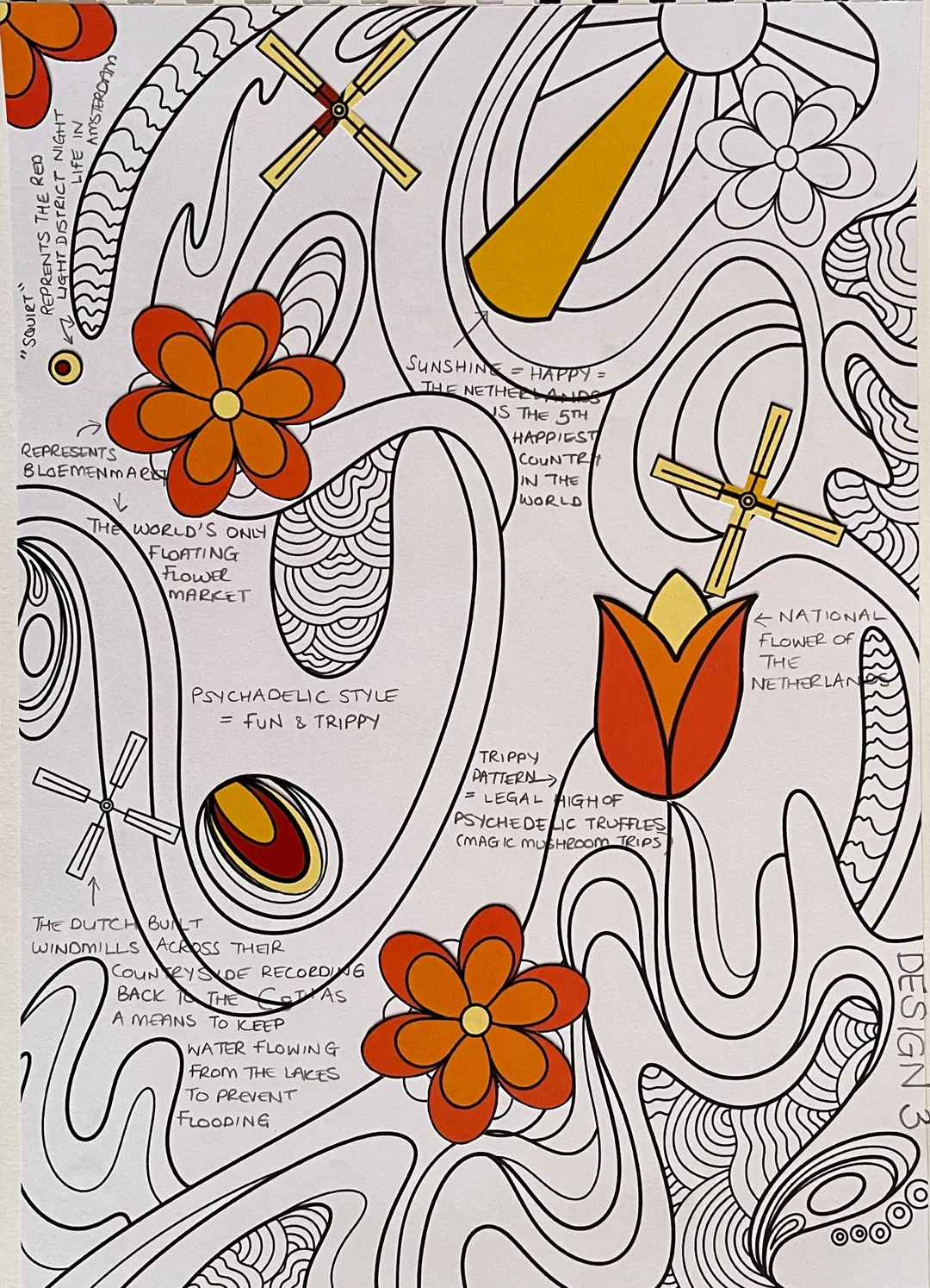
Design 3
Inspired by The Big Five San Francisco poster artists. To be honest, I think I had already decided what I wanted to do, right at the beginning.
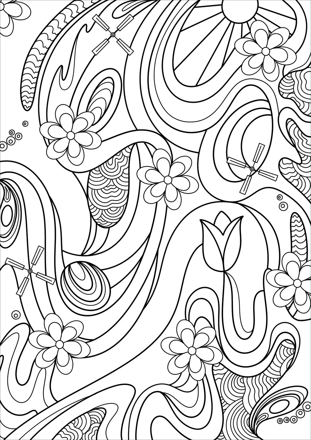
Chosen Design
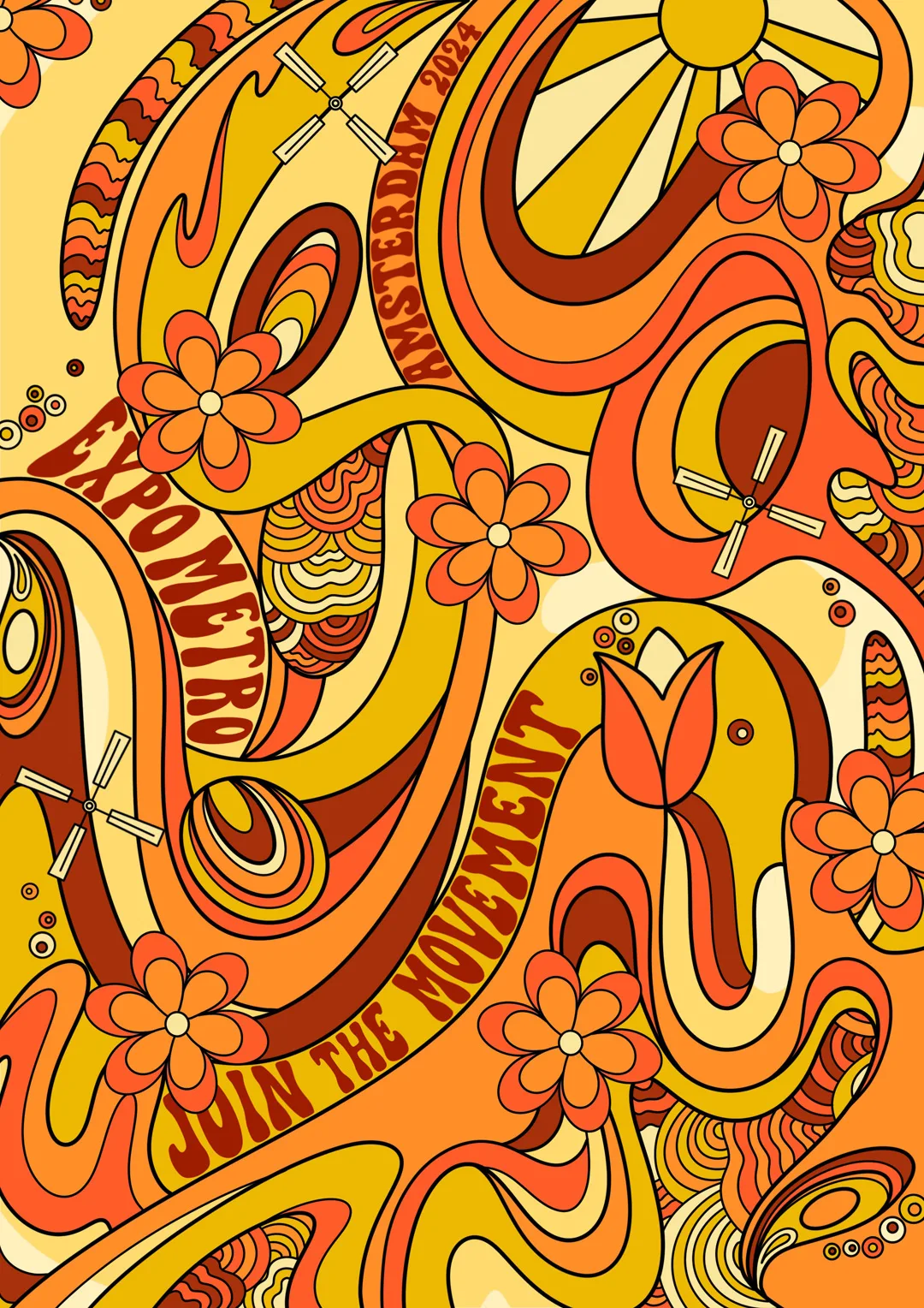
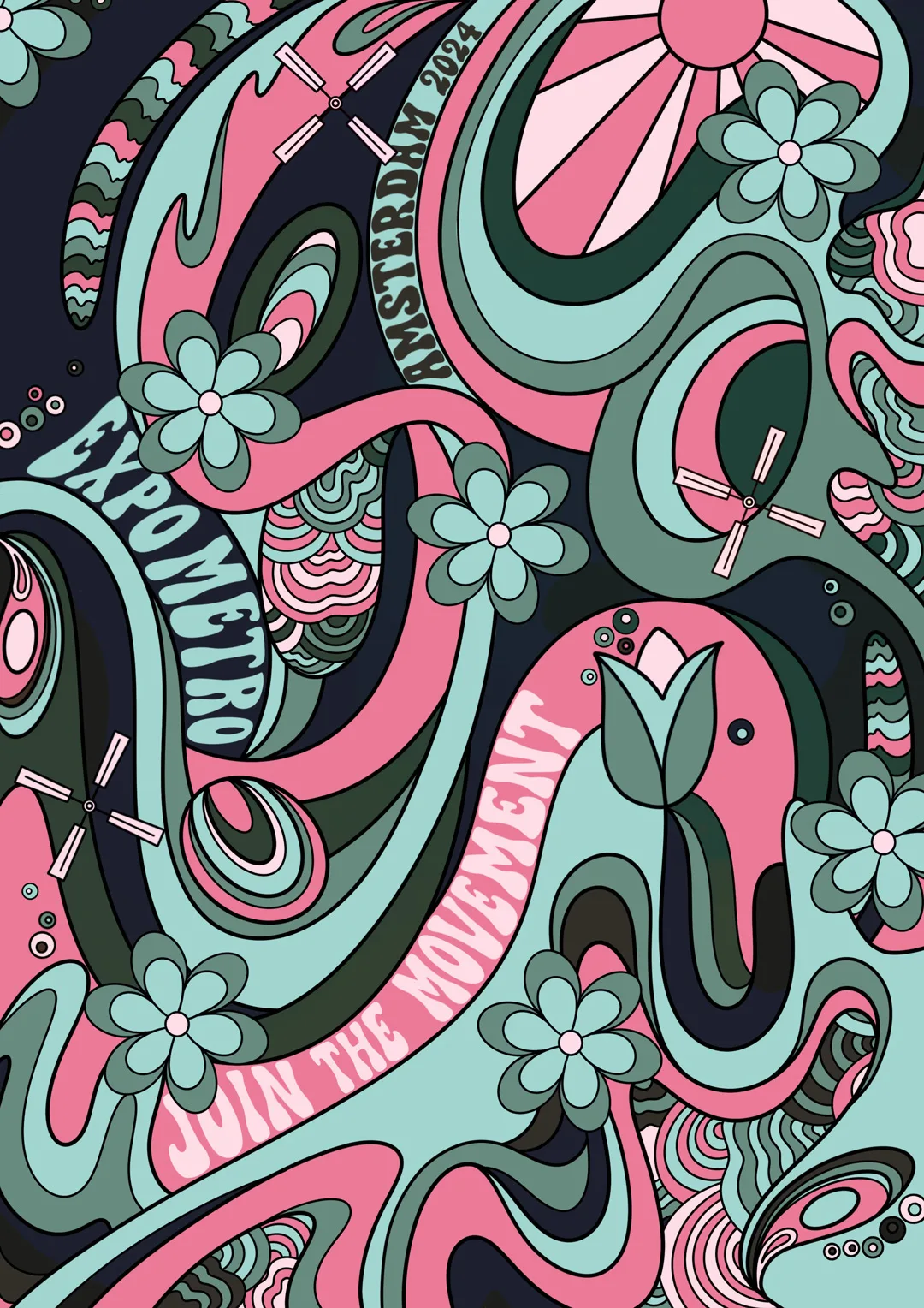
Colour Variations
The first colour palette has been taken from Wes Wilson’s iconic Grateful Dead and Otis Rush, 1967 psychedelic poster.
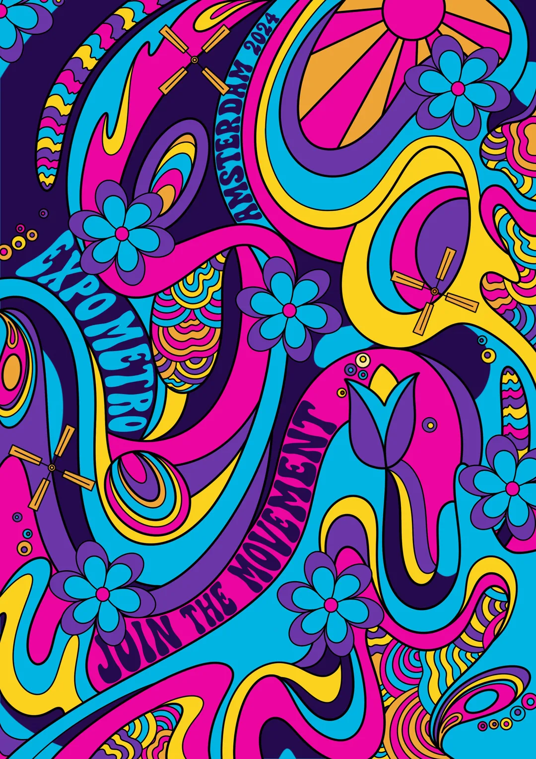
Final Poster
I wanted the design to stand alone, so I decided to place it in the centre
with the additional event information on the outside so as not to detract from it.
