You know me, one thing I love about starting an art piece, is diving into the research: buying new art books, reading various articles and perspectives from online sources and relishing in the artist’s process.
It’s even more rewarding when it’s Dutch artist, Piet Mondrian, a recurring influence in my own artistic career.
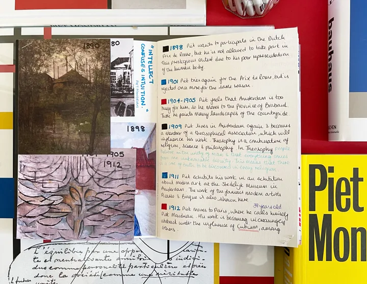
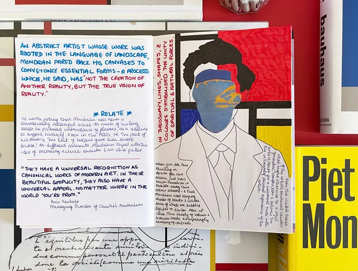
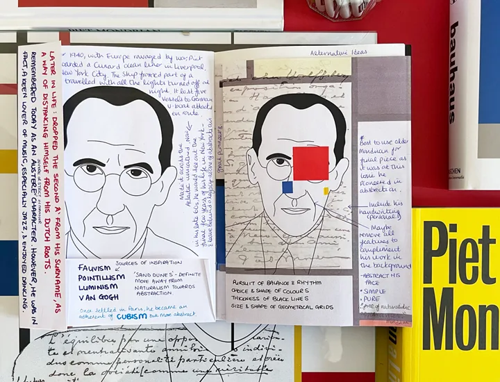
I have to admit, I didn’t know much about Mondrian. To follow his creative journey from his earlier works of landscapes and flowers to his experimentation with Cubism, and finally finding his true self in the *Neoplastic style is inspiring. For me, his work has always been iconic and recognisable – perfect symmetry, pure colour, balance, and harmony – but now I notice the careful brush strokes, the relationship between the coloured lines and white space. I understand what he was trying to achieve: just as nature expresses the Fibonacci sequence in its growth and the basis of computing is made up ones and zeros, his art has the same premise stripped down, you have pure colour and basic lines.
With this in mind, my portrait of Mondrian had to exude the same energy and abstraction:
“The emotion of beauty is always obscured by the appearance of the object. Therefore, the object must be eliminated from the picture.”
Piet Mondrian
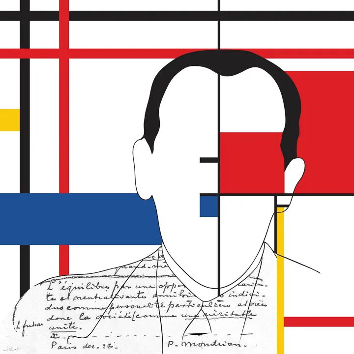
Or, in this case, the subject. Hence, first removing his facial features.
I decided to portray Mondrian’s older self as this was when his work really developed to what we know and love today.
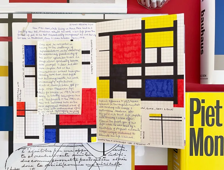
During the later period of his life, he was very much influenced by Theosophy – a movement that explored the connection between the physical and the spiritual. Mondrian believed that the vertical and horizontal lines *’represented the two essential opposing forces: the positive and the negative, the dynamic and the static’. I wanted him central to the composition which is why I used his *Composition With Red, Blue, And Yellow, 1931 in the foreground and *New York/Boogie Woogie, 1941 (detail) in the background and overlapped the elements to give the illusion of depth as if he was on another plane of existence.
Lastly, I had to incorporate Mondrian’s signature. For me, if it’s possible for any portrait I do, this personal touch is so important to finish a piece off and one’s handwriting carries through personality to reinforce the overall piece. In this case, not only do you have his written signature but also the line he draws cleverly matches his shoulder shape – happy accident.
A Portrait Of Piet is not only part of a series I am currently working on celebrating the main artists that have shaped my creative journey over the decades, but is also an exhibition piece which will be displayed with Expo Metro in Amsterdam. The expo will run from 15th – 21st June for seven days on the largest digital billboard in Amsterdam Central Station. Be sure to check it out if you’re there – I’m on billboard 2.


*Neoplastic also known as De Stijl – an artistic style founded in 1917, rejecting the natural representation of things and purifying it to simple shapes and primary colours.
* Composition With Red, Blue, And Yellow, 1931 – chosen for the final piece because it’s one of my favourite Mondrian artworks
* New York/Boogie Woogie, 1941 – chosen because of my New York Expo Metro piece and I love the fun phrase “boogie woogie”. Additional fun fact : despite Mondrian’s perceived austere character he absolutely loved jazz and dancing.
*from Piet Mondrian’s Principles of Neo–Plasticism essays. This particular one is the third page of Principes Généraux du Néo-Plasticisme. https://www.